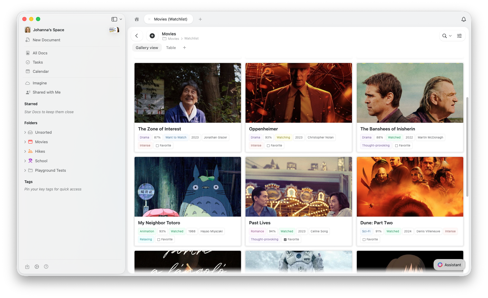
Gallery View vs. Table View
Les deux vues affichent les mêmes données — passer de l’une à l’autre ne supprime ni ne modifie vos entrées.| Utilisez Gallery quand… | Utilisez Table quand… |
|---|---|
| Les entrées contiennent des images ou du contenu visuel | Les données sont principalement du texte |
| La navigation visuelle est importante (portfolios, médias, moodboards) | Vous comparez plusieurs champs côte à côte |
| Vous souhaitez un aperçu compact avec moins de propriétés visibles | Flux de travail de type tableur |
Créer une Gallery View
- macOS / Web
- iOS
Sur Mac et le Web, vous pouvez également convertir une vue existante en utilisant Turn Into depuis le menu de configuration (⋯). Cela modifie le type de la vue actuelle sans en créer une nouvelle.
Revenir à Table View
Si vous avez plusieurs vues, cliquez sur l’onglet Table en haut de votre Collection. Si vous n’avez qu’une seule Gallery View, utilisez le menu de configuration (⋯) pour ajouter une nouvelle Table View ou utilisez Turn Into pour convertir. Vos données sont toujours en sécurité — changer de vue ne modifie jamais vos entrées.Types d’aperçu
La Gallery View récupère les images d’aperçu à partir du contenu de la page de chaque entrée. Pour ajouter une image à l’aperçu d’une carte, ouvrez l’entrée et ajoutez un bloc image à son contenu. Vous pouvez contrôler l’affichage de la zone d’aperçu de chaque carte :- Document (par défaut) — affiche un aperçu du contenu de la page de l’entrée
- Fill — remplit la zone d’aperçu de la carte avec l’image de l’entrée
- Immersive — utilise l’image comme arrière-plan pleine largeur de la carte
- Pas d’aperçu — masque entièrement la zone d’aperçu et n’affiche que les propriétés
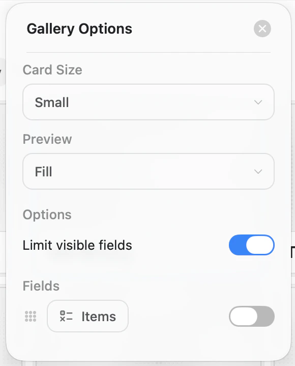
Tailles des cartes
Gallery View propose deux tailles de cartes :- Small — grille compacte, plus de cartes visibles à la fois
- Large — aperçus plus grands, moins de cartes par rangée
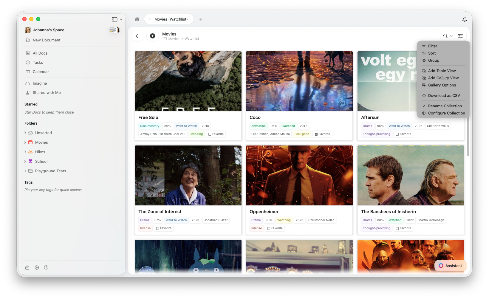
Gallery Options
Accédez aux Gallery Options depuis le menu de configuration (⋯) pour personnaliser votre vue :- Card Size — Small ou Large
- Preview — Document, Fill, Immersive ou Pas d’aperçu
- Limit visible fields — lorsque cette option est activée (par défaut), les cartes affichent un nombre limité de propriétés avec un indicateur « +n » pour le reste. Désactivez-la pour afficher tous les champs activés sur chaque carte.
- Fields — choisissez quels champs apparaissent sur chaque carte et activez ou désactivez leur visibilité
Travailler avec les cartes Gallery
- Ouvrir une entrée — cliquez sur une carte pour ouvrir sa page complète
- Menu contextuel — clic droit (Mac) ou appui prolongé (iOS) pour plus d’options
- Sélectionner des cartes — cliquez pour sélectionner, Maj+clic pour la sélection multiple
Tri, filtrage et regroupement
La Gallery View prend en charge le tri, le filtrage et le regroupement — les mêmes options que celles disponibles dans Table View. Les galeries regroupées affichent des en-têtes de section entre les groupes de cartes.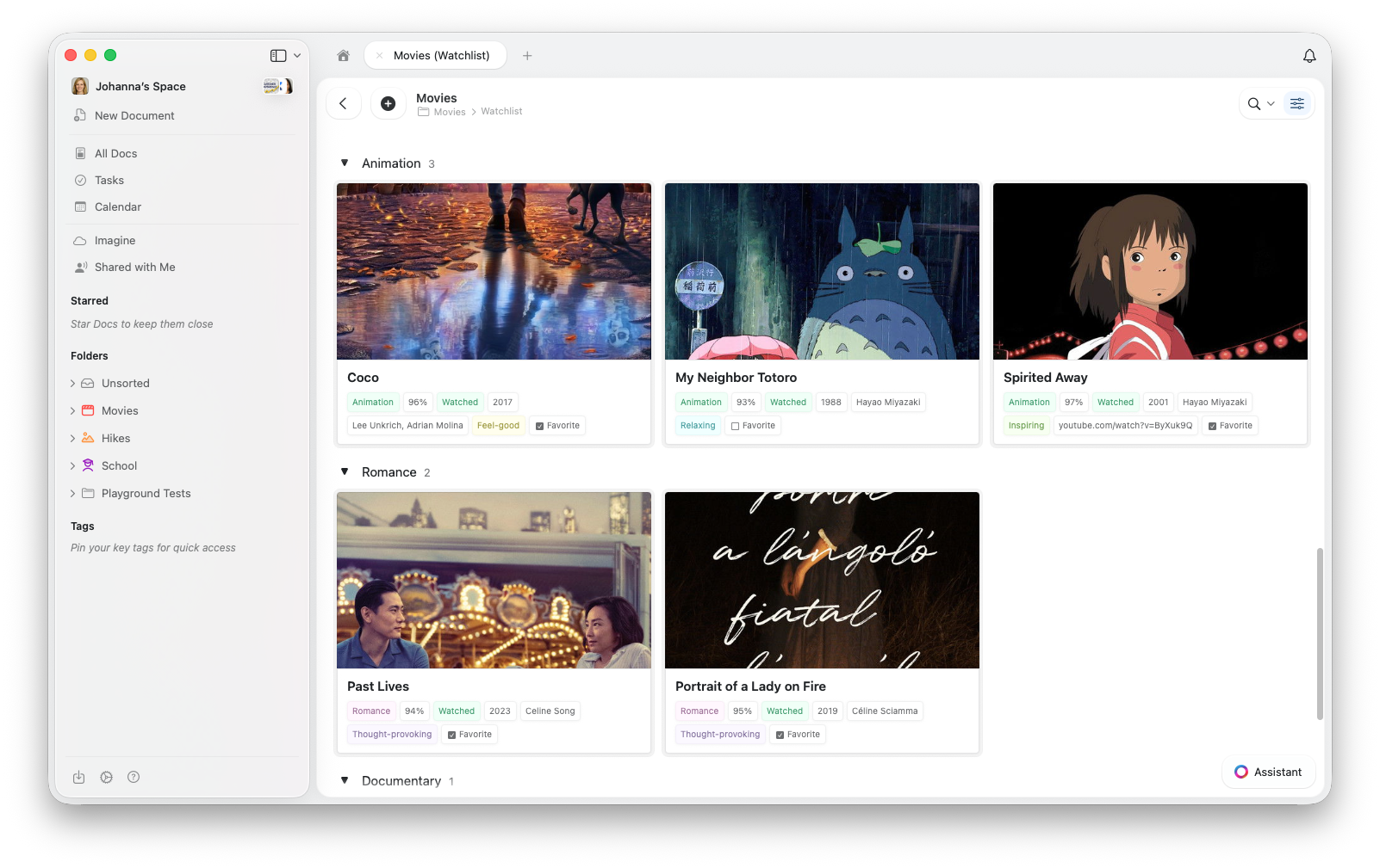
Dépannage
Mes cartes n'affichent pas d'images
Mes cartes n'affichent pas d'images
La Gallery View récupère les images d’aperçu à partir du contenu de la page de chaque entrée. Pour ajouter une image, cliquez sur une carte pour ouvrir l’entrée, puis ajoutez un bloc image au contenu de la page.Vérifiez également le réglage Preview dans les Gallery Options — définissez-le sur Document ou Fill.
Je ne trouve pas l'option Gallery View
Je ne trouve pas l'option Gallery View
Assurez-vous que votre application est à jour. Vérifiez les mises à jour dans votre magasin d’applications ou actualisez votre navigateur.
La Gallery est lente avec beaucoup d'entrées
La Gallery est lente avec beaucoup d'entrées
La Gallery View charge les aperçus d’images au fur et à mesure du défilement. Si les performances semblent lentes, essayez de réduire le nombre de propriétés visibles sur chaque carte.
Articles connexes
Collections
En savoir plus sur les Collections Craft et les types de champs
Collection Views
Créez des vues avec tri, filtrage et regroupement
Réorganiser les champs et colonnes
Personnalisez l’ordre des champs et colonnes dans vos Collections
Utiliser les Collections sur iOS
Collections optimisées pour le tactile sur iPhone et iPad